🎨 Scalable & Accessible Design System for Unified Digital Experiences
Client
Digital Design System: Design Essentials
Overview
This design system was created to establish a consistent, scalable, and accessible visual language for digital product development. It serves as a centralized source of truth that aligns user interface components, visual identity, and interaction patterns across platforms. The system is built with modularity and reusability in mind, ensuring seamless collaboration between designers and developers while accelerating the design process.
Objective
To create a robust and user-friendly design foundation that supports brand consistency, responsiveness, and accessibility across web and mobile interfaces.
Key Components:
This design system is built as a shared language to ensure consistency, scalability, and accessibility across digital products. It includes a clear typography scale, a brand-aligned color palette meeting AA+ standards, and a responsive 8-point grid system for structured layouts. A robust library of reusable UI components supports flexible design and development, while a custom icon set ensures visual clarity and cohesion. Interactive elements bring the experience to life through intuitive motion, and detailed documentation enables seamless implementation and collaboration across teams.
Scope of Work

📚 Design Principle 01: Hierarchy
Hierarchy is a foundational design principle that guides the viewer’s eye to what matters most. It defines the order of importance within a composition by creating visual contrast between elements such as headings, subheadings, body text, buttons, and other UI components.
🧠 Why Hierarchy Matters
Without visual hierarchy, users are forced to work harder to understand the content. Competing elements can confuse them, reduce clarity, and make interfaces feel unorganized or overwhelming. Effective hierarchy makes content scannable, intentional, and aligned with user expectations—especially in fast-paced digital environments.
❌ Poor Hierarchy (Top Example)
All elements look similar in size and weight
There’s no clear focal point
The user’s eye doesn’t know where to begin or what is most important
Results in cognitive overload and weak engagement
✅ Good Hierarchy (Bottom Example)
The most important element stands out clearly (e.g., title or call-to-action)
Supporting elements are scaled down appropriately
White space, contrast, and grouping are used to guide the eye naturally
The layout feels intentional, easy to read, and user-friendly
🛠 How I Applied It
In this slide, I used:
Bold typography for the title to establish dominance
Color contrast (pink for the keyword) to emphasize the main principle
Visual cues (✔️ and ❌ icons) to guide understanding
Spacing and alignment to differentiate sections clearly
Side-by-side comparison to visually reinforce best practices
🎨 Design Principle 02: Color Palette
Color is one of the most powerful tools in visual design—it evokes emotion, conveys brand identity, and guides user interaction. An effective color palette creates visual harmony, reinforces hierarchy, and ensures accessibility across digital platforms.
🧠 Why Color Matters
Color is more than decoration—it’s functional. It distinguishes between primary actions and secondary content, highlights key information, and builds emotional connection. A well-crafted palette enhances usability and ensures that all users, including those with visual impairments, can interact with content effortlessly.
🔍 What This Visual Demonstrates
❌ Ineffective Color Usage (Top Example)
Overuse of similar shades creates confusion
No clear contrast between UI elements
Poor accessibility (e.g., red on pink is hard to read)
Visually overwhelming and lacks guidance
✅ Effective Color Application (Bottom Example)
Primary and secondary colors are used intentionally
Clear contrast improves legibility and draws attention to key elements
Background and foreground colors are balanced
Harmonious and brand-consistent
🛠 How I Applied It
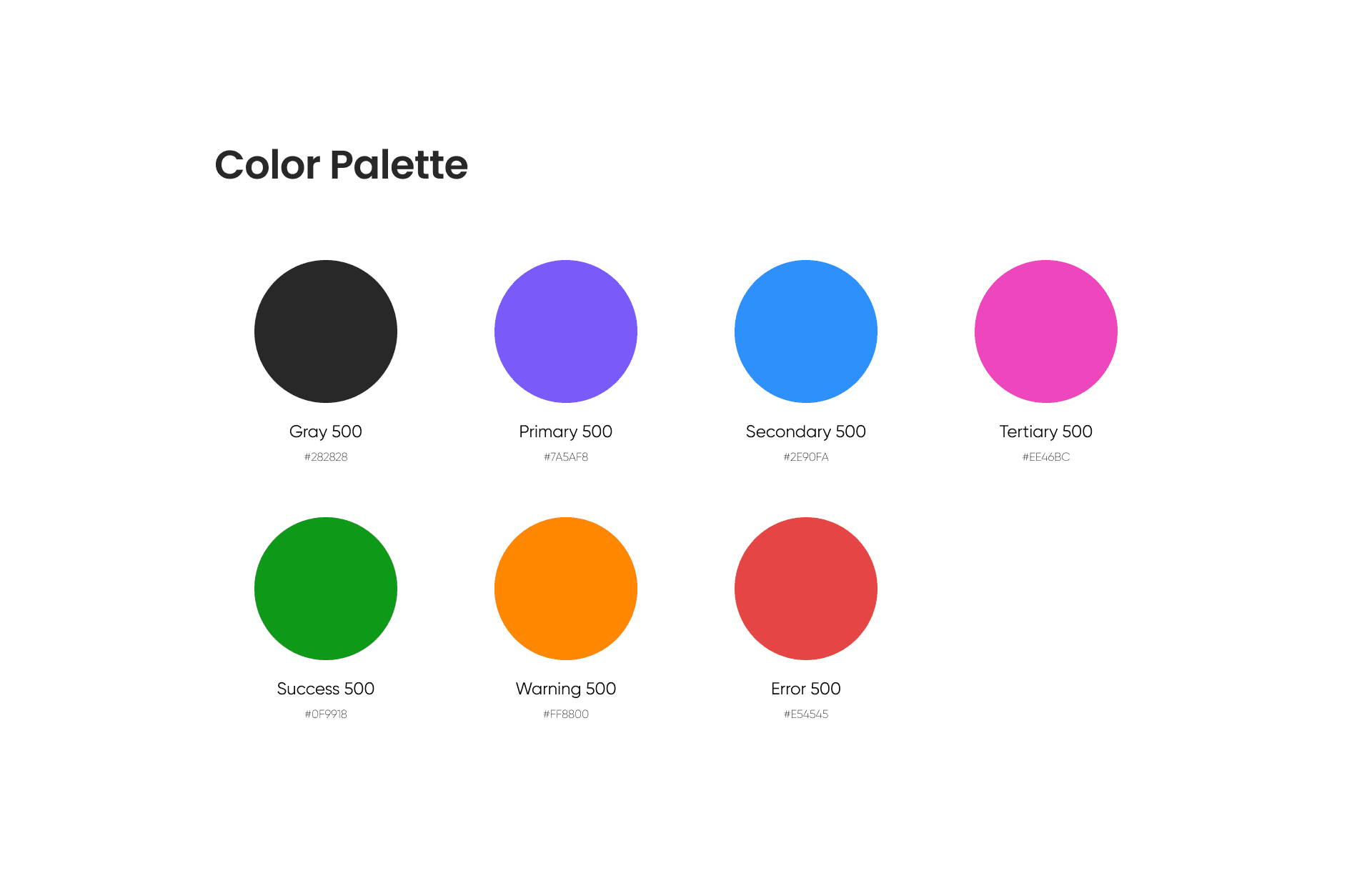
In my design system, I curated a modular and accessible color palette that includes:
Primary Colors: The dominant brand hues used in headers, buttons, and interactive elements
Secondary & Accent Colors: Used sparingly to add vibrancy and highlight secondary actions
Neutral Colors: Soft grays, whites, and blacks to balance layouts and maintain readability
Status Colors: Red for errors, green for success, yellow for warnings—all meeting WCAG contrast ratios
Each color is tested for accessibility, ensuring AA+ compliance for both text and UI elements. I also created light and dark mode variations, enabling seamless theme transitions without compromising clarity.

✍️ Design Principle 03: Typography
Typography is the backbone of visual communication. It shapes how users absorb content, navigate information, and perceive brand tone. Well-crafted typography ensures clarity, hierarchy, and emotional resonance across all touchpoints.
🧠 Why Typography Matters
In digital interfaces, words are everywhere—but it's how they are presented that makes the difference. Typography influences readability, accessibility, and attention flow. Poorly structured type leads to confusion, fatigue, and inconsistent user experiences.
🔍 What This Visual Demonstrates
❌ Weak Typography Structure (Top Example)
All text appears similar in size and weight
No clear distinction between headline and body content
Line spacing and alignment feel cramped
Results in a flat, unreadable layout
✅ Strong Typographic Hierarchy (Bottom Example)
Clear contrast between heading, subheading, and body text
Strategic use of font weight and size to guide reading order
Adequate line height and spacing improve legibility
Overall layout feels structured and easy to scan
🛠 How I Applied It
For this design system, I created a comprehensive typography scale that is responsive, accessible, and brand-aligned. It includes:
Font Pairing: A clean sans-serif typeface for headings and body, chosen for clarity and versatility
Typographic Scale: Harmonized sizes (e.g., H1–H6, subtitles, captions) to maintain visual rhythm across devices
Font Weights & Styles: Used to build contrast and communicate tone—bold for emphasis, light for subtlety
Line Height & Spacing: Calibrated for readability, especially on mobile and long-form content
Accessibility Compliance: All text styles meet AA or higher contrast standards when placed on backgrounds
I also established text spacing guidelines and modular classes so developers and designers can apply consistent styles across all screens effortlessly.
✨ Impact
Strong typography elevates the user experience. It empowers users to consume content effortlessly, supports cognitive flow, and ensures brand voice comes through clearly and consistently.

📏 Design Principle 04: Grid & Spacing
Grids and spacing are the invisible framework that bring structure, rhythm, and balance to any design. A consistent grid system ensures that every element—whether text, image, or button—feels intentional and aligned, creating a sense of harmony and professionalism across screens.
🧠 Why Grids and Spacing Matter
Without proper spacing and alignment, even the most beautiful designs can feel cluttered or chaotic. A solid grid system helps maintain visual order, guides the user’s eye naturally through content, and ensures adaptability across responsive layouts.
🔍 What This Visual Demonstrates
📐 Bootstrap 5 Grid System
A classic 12-column layout with a total container width of 1320px
Each column is 88px wide, separated by 24px gutters
This structure is widely used in modern UI frameworks to create responsive, consistent designs across devices
The grid provides designers with flexibility to span content across multiple columns (e.g., 6-column card, 4-column image) while preserving consistent alignment.
🛠 How I Applied It
In my design system, I leveraged the Bootstrap 5 grid foundation and combined it with an 8-point spacing scale to bring uniformity across layouts. Key implementations include:
12-Column Grid: Offers versatility for creating complex or simple layouts
Consistent Gutters: 24px spacing between columns to maintain breathing room
8pt Spacing System: Used for padding, margins, and component spacing—scales cleanly across screen sizes
Responsive Behavior: Grid adapts seamlessly from desktop to tablet to mobile, ensuring layout integrity
This disciplined structure not only makes layouts more readable and aesthetically pleasing, but also simplifies handoff to developers and ensures pixel-perfect implementation.
✨ Impact
A strong grid system ensures scalability and visual clarity. It accelerates design workflows, maintains brand consistency, and allows users to effortlessly navigate content—whether they are viewing it on a laptop, tablet, or mobile device.

🖼️ Design Principle 05: Iconography
Iconography is the visual shorthand of a product—conveying meaning at a glance, guiding user actions, and enhancing comprehension without relying on text. Well-designed icons bring clarity, personality, and visual balance to interfaces, helping users navigate with confidence.
🧠 Why Iconography Matters
Icons play a vital role in user experience by reducing cognitive load and enhancing interface efficiency. But for icons to be effective, they must be clear, consistent, and accessible. Poorly designed icons can confuse users, dilute brand identity, and lead to frustration.
🔍 What This System Demonstrates
In my design system, I created a cohesive and scalable icon set that integrates seamlessly with the overall visual language. Each icon is:
Built on a pixel-perfect grid to ensure sharpness and alignment
Designed with consistent stroke weight and corner radii for visual harmony
Optimized for multiple sizes, maintaining clarity at both 16px and 64px
Styled in line with brand tone, whether minimal, friendly, or functional
Icons include core UI elements like search, settings, notifications, actions (edit, delete, save), navigation (home, back, forward), and more.
🛠 How I Applied It
Created custom icons as vector components in Figma
Maintained a unified visual rhythm through grid snapping and stroke scaling
Developed solid and outlined versions to support light/dark mode use cases
Annotated each icon with semantic naming for easy asset management
Ensured accessibility by pairing icons with visible labels where necessary
Each icon is built to be reused across the design system—whether in buttons, navigation bars, tooltips, or modals—ensuring brand alignment and interface intuitiveness.
✨ Impact
Clear and consistent iconography enhances usability, speeds up recognition, and adds polish to the overall design. It elevates the product experience by creating intuitive touchpoints that speak a visual language users can trust and understand instantly.