An Intuitive Digital Experience for Modern Integrative Medicine
Client
Restoration Medicine
Year
2025
Overview:
Restoration Medicine is a holistic healthcare clinic specializing in integrative and pelvic health. I was introduced to this project during a startup meet conference hosted by The Roux Institute, where over 10 startups pitched their healthcare ideas. After presenting my design work, I was approached by Tom Hunter, who was impressed with my presentation and asked me to lead the full design and development of Restoration Medicine’s website. As the Design Wizard for the Entrepreneurship team at The Roux Institute, I took on the project end-to-end from research and wireframing to visual design and development on Wix creating a calm, patient-centered digital experience that reflects the clinic’s care philosophy and makes pelvic health services more accessible.
Understanding the Problem:
One of the core challenges was designing for a subject as sensitive and personal as pelvic health. The content needed to be informative but not clinical, comforting but still credible. The clinic also wanted to highlight a range of services, build immediate trust with visitors, and make appointment scheduling effortless especially for those who might feel overwhelmed or unsure about seeking help. With no prior site structure or branding system in place, I had to build everything from the ground up while ensuring that the end result was accessible, mobile-friendly, and visually aligned with their healing approach.
Scope of Work


Research & Design Approach:
My design process began with direct conversations with the clinic founder to deeply understand their values, tone, and the kind of experience they wanted to offer their patients. Since the focus was not only on integrative care but also on pelvic health, a subject many patients find sensitive — I knew the website had to balance professionalism with warmth. To ground the experience in both trust and empathy, I mapped out a clear sitemap that could guide users through information without overwhelming them.
As part of my competitor analysis, I studied platforms like Oshi Health, which stood out for its modern, reassuring approach to digestive and integrative care. Their site tackled sensitive topics with confident simplicity and supportive messaging, something I drew inspiration from while crafting the pelvic health section for Restoration Medicine. I ensured that similar principles were followed organizing services with clarity, using comforting tone in content, and reducing any friction in the booking process.
Visually, I built the website around the four primary colors from the Restoration Medicine Puzzle logo,

allowing the brand identity to feel cohesive across every section. The palette, paired with rounded typography and calm, inviting imagery, gave the interface a sense of softness without losing structure. From educational sections to call-to-action buttons, every element was thoughtfully styled to reduce anxiety and make users feel supported, particularly those navigating pelvic health for the first time.


My Approach :
Before starting the wireframes, I spent time understanding the emotional and informational barriers patients often face when seeking pelvic health care. I asked John Neal, the clinic to share their internal resources and was given a PDF of a book written by Dr. Elise De, MD "Facing Pelvic Pain", which offers deep insight into pelvic floor conditions and patient challenges.
Reading it helped me grasp both the emotional and clinical aspects of care, which directly shaped how I structured the wireframes in Miro. I focused on simplifying navigation, addressing common concerns early, and creating a layout that felt informative yet supportive from the very first scroll. This helped me empathize not just as a designer, but as a problem-solver.

Phase 1:
The initial flowchart helped visualize how users would navigate the site from landing on the hero section to either learning more or heading straight to the contact form. I used this to identify key decision points, simplify the user path, and ensure a logical, conversion-focused flow.
To go deeper, I also created a mindmap that broke down each major section such as the Hero, About, Services, and Contact into smaller content blocks. This allowed me to focus on what mattered most in each part of the experience: for example, guiding users through visual cues in the pelvic health section, highlighting patient concerns, and prompting action through a clear call-to-action. These visual wireframes made it easier to validate structure early, clarify content needs, and ensure the final design would reflect both patient psychology and the clinic’s values.

Low Fidelity Wireframe Design:
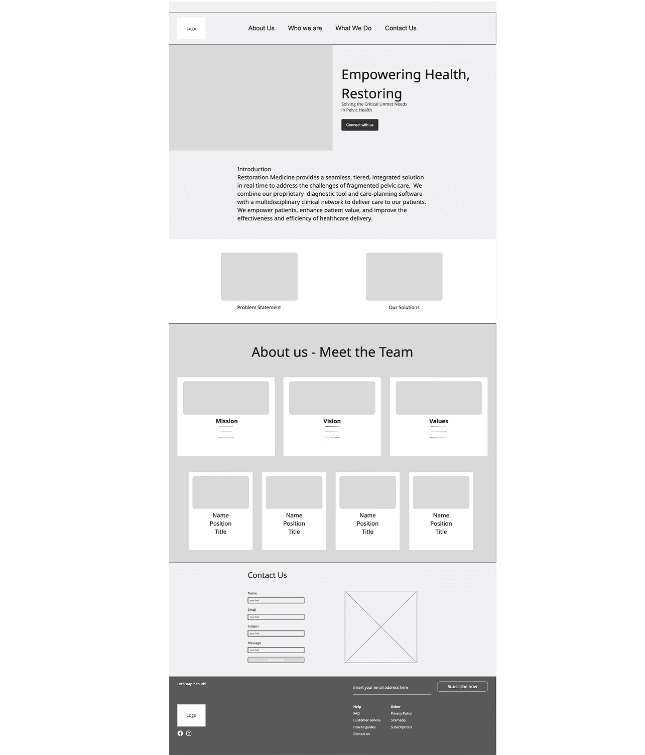
Once the information architecture was in place, I translated it into wireframes to visualize the layout and content distribution. I used simple blocks to represent sections like the hero message, introductory content, solution overview, and team details. These wireframes made it easier to iterate with stakeholders and ensure alignment before any development began.
Document given to client, I have converted the pdf to an image for easier view to showcase here:
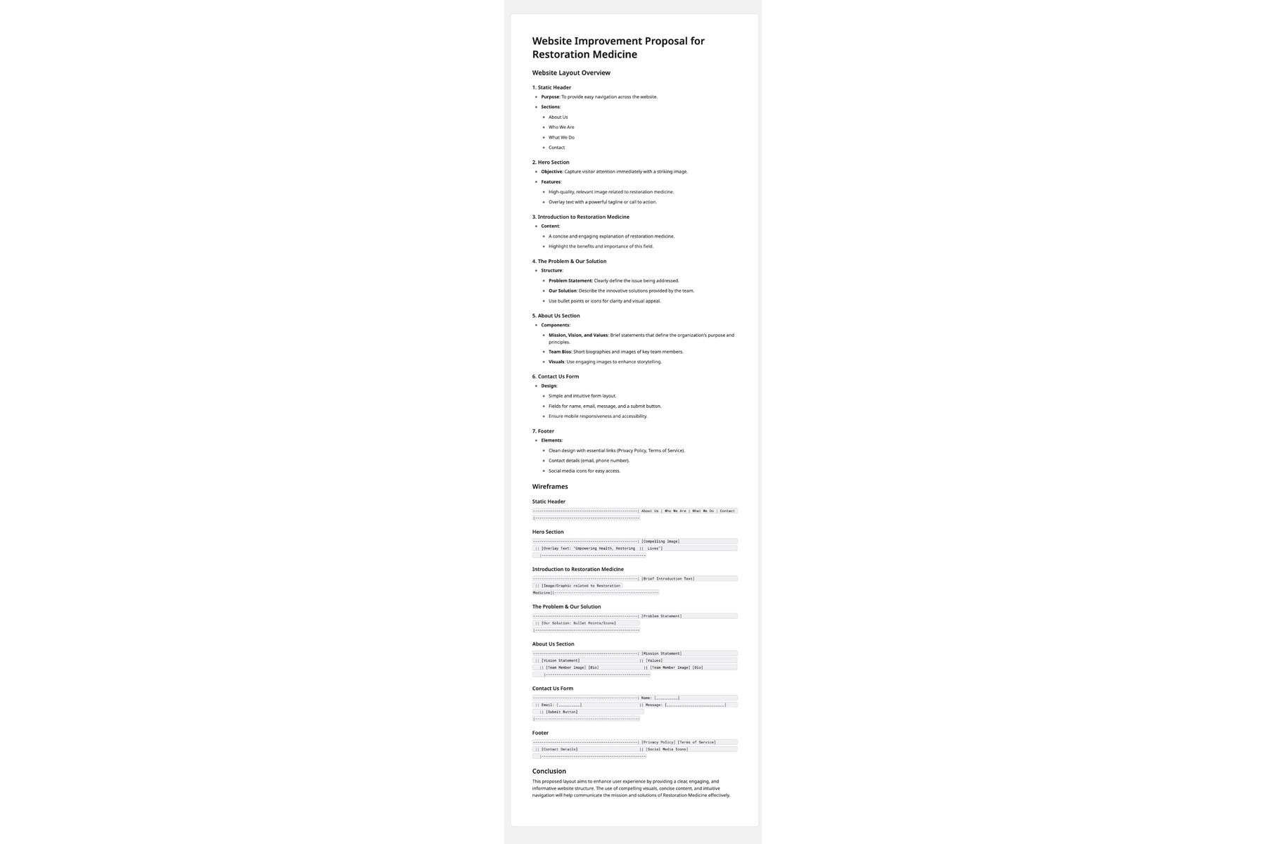
You may view it here:
https://drive.google.com/file/d/1Ko3pjRfAe6Wo6l-VfxIpx0DoC_5qUgLW/view?usp=sharing
Building the Final Website:
Once the wireframes were tested and approved, I moved into development using Wix. I customized each section with modular flexibility in mind, giving the client the ability to update content over time. I optimized the website layout to accommodate tap-friendly navigation, and clear callouts—crucial for the clinic’s broad patient base that includes older users.
The final website presents a unified, trustworthy brand identity. Visitors can quickly understand what Restoration Medicine offers, feel emotionally supported, and take the next step toward care without confusion. Each page feels light, open, and thoughtfully crafted just like the experience patients can expect in person.
Client Impact:
After launch, the team received positive feedback from both patients and peers. Appointment inquiries increased within the first few weeks, and many patients commented on how informative and welcoming the pelvic health section felt. The website now serves as an essential extension of the clinic’s practice building trust even before a conversation begins.
Reflection:
This project was an important reminder of what thoughtful design can do especially in healthcare, where emotions, trust, and clarity matter just as much as aesthetics. Balancing sensitive subject matter with usability required empathy, deep listening, and careful design decisions at every step. I am proud of how professionally the site came together and how it now serves not just as a website, but as a trusted starting point for people on their healing journey.