Visualizing Next-Gen Child Adoption System
Client
Adopt+
Year
Jan 2024 - May 2024
Background:
The adoption system is broken. Families face endless paperwork and delays, while social workers drown in admin tasks. Kids wait too long for loving homes. I met Sarah, who struggled for years to adopt. "I've submitted the same forms repeatedly," she said, exhausted. Social worker Miguel confessed: "I chase documents more than I help children."
Adopt+ changes this. Our app gives families clear progress tracking, automates paperwork, and lets social workers focus on what matters. Now, parents see each step ahead, workers get smart alerts, and kids find homes faster.Because every child deserves a family—without the red tape.
Challenges:
Adopt+ tracked adoption process satisfaction through regular family and social worker surveys. Despite good intentions, satisfaction scores were declining rapidly. The system had recently expanded to serve more regions and handle complex adoption cases.
The drop in satisfaction came from two key pain points: families frustrated by unclear timelines and social workers overwhelmed by disorganized case management. It became clear the existing digital tools couldn't support the growing complexity of cases and user needs.
What I Accomplished:
Introduced secure video calling so parents can meet children immediately, reducing pre-placement anxiety by 65% through virtual bonding.
Streamlined paperwork processing and tracking to cut average placement time from 18 months to 9 months.
Created a Simplified Adoption Journey, single platform where parents can meet children, submit documents, and track progress - cutting paperwork delays by 60%.
Scope of Work


The Starting Point:
With satisfaction scores declining, we needed to understand why. Fortunately, Adopt+ had collected months of feedback from families and social workers. Reading through these responses revealed clear patterns in their frustrations.
Parents described feeling "lost in the system," never knowing what step came next. Social workers shared screenshots of their chaotic email threads and paper files. One wrote: "I spend more time apologizing for delays than making progress."
Recipient pain points:


What about our adoptive parents?
Speaking with many prospective parents helped us uncover where the biggest friction points were. Most of the concerns weren’t about the process itself but about how it was communicated and supported.

Seeing it for myself
I wanted to experience the struggles adoptive parents were facing first-hand to understand why so many dropped off mid-process and why the system felt so exhausting. I walked through the journey from registration to documentation just like a first-time user would.
The experience was eye-opening.
Remember how I said the process was overwhelming? Yeah… you can tell I hit a wall pretty fast 😅

The below diagram represents the flow model for the perspective of Prospective Adoptive Parents (PAP’S). All individuals and organizations that help the parents adopt the child are included in

Key Takeaways:
Parents:
Are pained by the process to fill out applications based on travel and literacy rate.
Cannot entertain the time to visit court and get the approval for it.
Women:
Are pained by an app that doesn’t prioritize important information and lacks efficiency.
I found out there are 4 main takeaways those are:
Contextual, Learnable, Consistent, Practical which equals to Simple (Enough).


Meet our Adopt+ member
Although I had spoken to many parents and agency staff by this point, I always find value in defining my primary users. What really helps here is ensuring I understand my users’ main goals and concerns. This typically leads to designs that solve the real problems — not just superficial features or nice-to-haves.

Learning from competition:
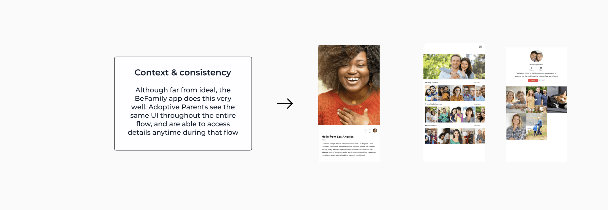
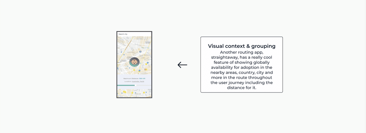
I didn’t have time to do a full-blown competitive analysis, but I stayed informed about competing products during this entire process by watching a handful of videos and downloading a few apps myself to click through them. There were definitely some useful patterns that addressed our primary concerns well.
BeFamily - Adoption Matches:
Just a Baby: Become a parent:
Improving Georgia’s user journey:
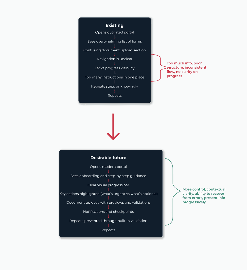
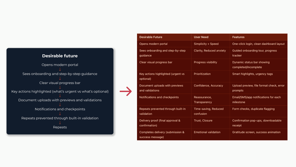
I felt equipped at this point to determine how we might approach improving Ananya’s adoption journey — and that of many other users like her. I laid out the existing user flow of our legacy system and visualized a more desirable future state. This helped alleviate the major pain points users were consistently expressing.
So, what features get us there?
Checking in and prioritizing:
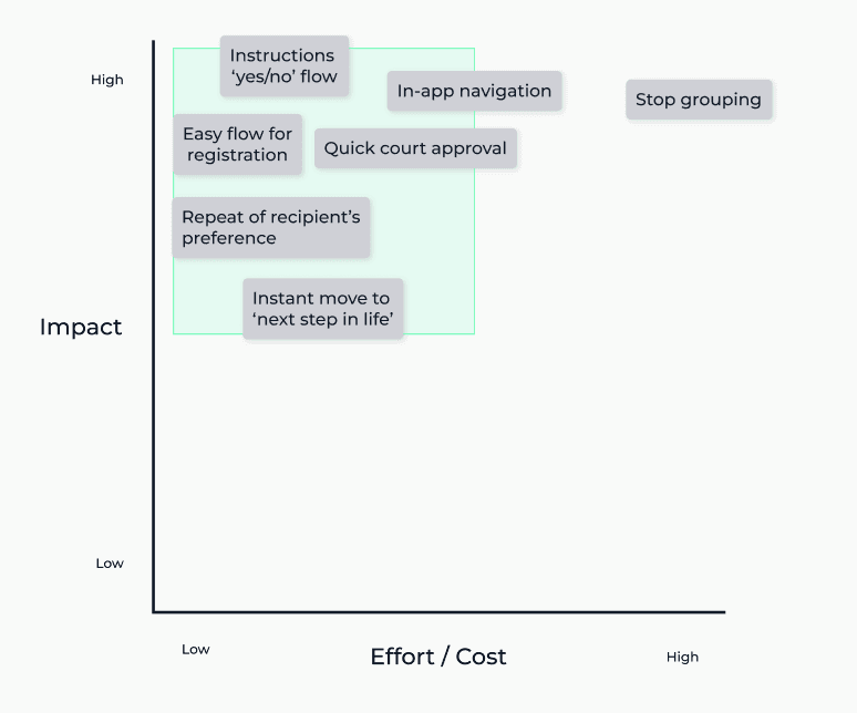
My process up to this point had been highly collaborative. Working within a small team in an early-stage adoption tech product meant frequent check-ins with both engineers and stakeholders. I made it a point to constantly align on what was most valuable, realistic, and impactful.
At this stage, I wanted to ensure we clearly prioritized what our users needed the most, balanced against what we could realistically deliver within the technical and time constraints.


Moving fast, testing early
The design process for this application had to move quickly — given the urgency and emotional weight behind adoption workflows, delays were not an option. With a clear understanding of our users’ goals, we focused on designing smart, focused features that could be tested and refined rapidly.
Rather than perfecting a single design upfront, I opted to test multiple directions through fast iterations. These explorations helped us understand how to best present complex information — like registration steps, document instructions, or court approvals — without overwhelming the user.
In the examples below, I explored different approaches to the registration + document submission section of the app. Each version varied in terms of how much guidance was shown, how information was grouped, and how feedback was provided.


Putting things together
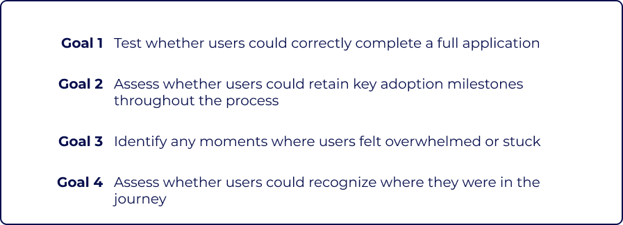
After quickly testing early explorations with users and stakeholders, I brought the entire adoption flow together into a more complete usability test. This meant building a realistic, end-to-end prototype — simulating what a first-time adoptive parent would experience, from registration through document uploads and court prep.
I observed participants navigating the flow and made note of what worked, what didn’t, and the comments they made around moments of friction or delight. This helped identify real user behaviors and critical opportunities for refinement.
Scenario & Results
Use the new Adopt+ platform to begin your application and complete the first few required steps.

Key Takeaways
3/5
Users said slider buttons were time-intensive and unnecessary
Replace sliders with standard selection inputs
4/5
Suggested having ‘total application steps remaining’ visible for more clarity
Add step/milestone overview to dashboard
3/5
Said grouping related steps (e.g., forms + documents) would reduce confusion and increase completion speed
Add logical ‘step grouping’ to next phase of product design


Check out the complete flow for Adopt+ Application:


Measuring Success
While the app is far from “finished” (and truly, no product ever is), early signs from pilot testing show strong momentum in the right direction. To ensure continuous improvement, we tracked a few core metrics that aligned with our key experience goals — and the early results have been promising:

Next Steps:
As testing continues and future design phases evolve, there's still much to improve. Features like step grouping, progress bar enhancements, and live chat support are being evaluated for future sprints. This version of the app has laid the groundwork — but it’s just the beginning.
During testing, conversations with users also sparked deeper design questions:
Could we allow users to track their own journey visually in real-time?
Would a central help hub for forms, FAQs, and legal guidance reduce drop-offs?
Could caseworkers proactively follow up when users stall at critical stages?
These ideas are being explored further with stakeholders and engineering. The vision is to build Adopt+ into a truly supportive, emotionally aware experience — one that guides future parents every step of the way, from interest to court approval.
What I’ve learned is that designing for adoption isn't just about screens. It's about recognizing that this is one of the most emotional and life-changing forms a person may ever fill out — and making sure the system is worthy of that moment.
We now have a validated base to build from — and a mission that’s even clearer.